Design Challenge
5 Oct 2022So, I’ve been working on translating the UI design created by the external designer into SwiftUI, and have done all of the easy bits:
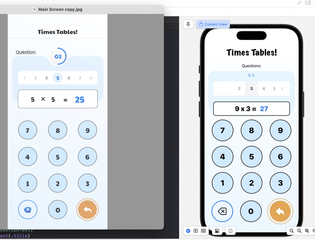
The rounded rectangles for things like the question display/number input are just ZStacks of roundedrects filled, then stroked:
ZStack {
    RoundedRectangle(cornerRadius: 10)
        .fill(.white)
        .padding(.horizontal)
    RoundedRectangle(cornerRadius: 10)
        .stroke(.black, lineWidth: 2)
        .padding(.horizontal)
    HStack {
        Text(questionText)
            .font(.title)
            .fontWeight(.heavy)
        Text(calculatorDisplay)
            .font(.title)
            .fontWeight(.heavy)
            .foregroundColor(.blue)
     }
}
.frame(maxWidth: 350)
.offset(y: 15)
Something I have learned in the process is the .offset modifer. This is what’s used to move a view from where SwiftUI would have placed it, and is what I’ve done to create that overlapped style where the question display/number input is sitting halfway over the bottom of the blue rounded rectangle. This is in the last line of the code above: .offset(y: 15) This is moving the whole ZStack down by 15. A trick to watch with this is that since you’ve messed with SwiftUI’s arrangement, it doesn’t then shuffle everything else around this - you need to manually deal with making some space below it.
The jobs still to do on this view is the customisation of the picker, which I think is going to have to be writing a picker from scratch (or finding the source for the library picker and altering it), and the even more custom combined picker/progress indicator.