Oct. 11, 2022
Since I have minimal design skills, I went back to Fiverr (the digital gig economy platform) to get some icons done for CodeTrimmer - explaining that I wanted something like a “pair of scissors floating over some computer code”. At the same time I’ve been playing with DiffusionBee - a free Apple silicon version of the Stable Diffusion artifical intellligence that generates images from text prompts. The image above was created on an M1 Macbook using DiffusionBee.
Oct. 5, 2022
So, I’ve been working on translating the UI design created by the external designer into SwiftUI, and have done all of the easy bits:
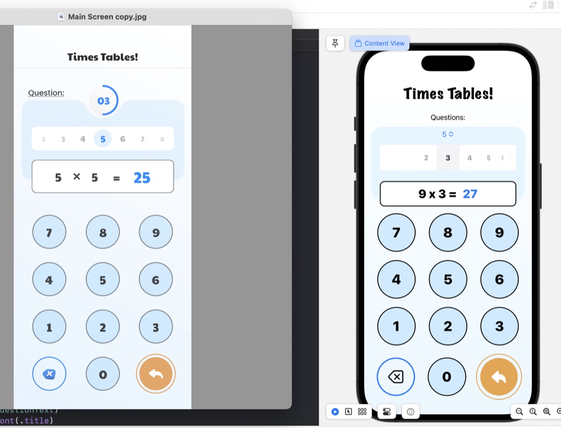
The rounded rectangles for things like the question display/number input are just ZStacks of roundedrects filled, then stroked:
ZStack {
    RoundedRectangle(cornerRadius: 10)
        .fill(.white)
        .padding(.horizontal)
    RoundedRectangle(cornerRadius: 10)
        .stroke(.black, lineWidth: 2)
        .padding(.horizontal)
    HStack {
        Text(questionText)
            .font(.title)
            .fontWeight(.heavy)
        Text(calculatorDisplay)
            .font(.title)
            .fontWeight(.heavy)
            .foregroundColor(.blue)
     }
}
.frame(maxWidth: 350)
.offset(y: 15)
Something I have learned in the process is the .offset modifer. This is what’s used to move a view from where SwiftUI would have placed it, and is what I’ve done to create that overlapped style where the question display/number input is sitting halfway over the bottom of the blue rounded rectangle. This is in the last line of the code above: .offset(y: 15) This is moving the whole ZStack down by 15. A trick to watch with this is that since you’ve messed with SwiftUI’s arrangement, it doesn’t then shuffle everything else around this - you need to manually deal with making some space below it.
Oct. 4, 2022
I’ve started work on trying to recreate a UI provided by a designer , and in the process needed to identify some colours from a PNG image. I found this great website for this exact purpose.
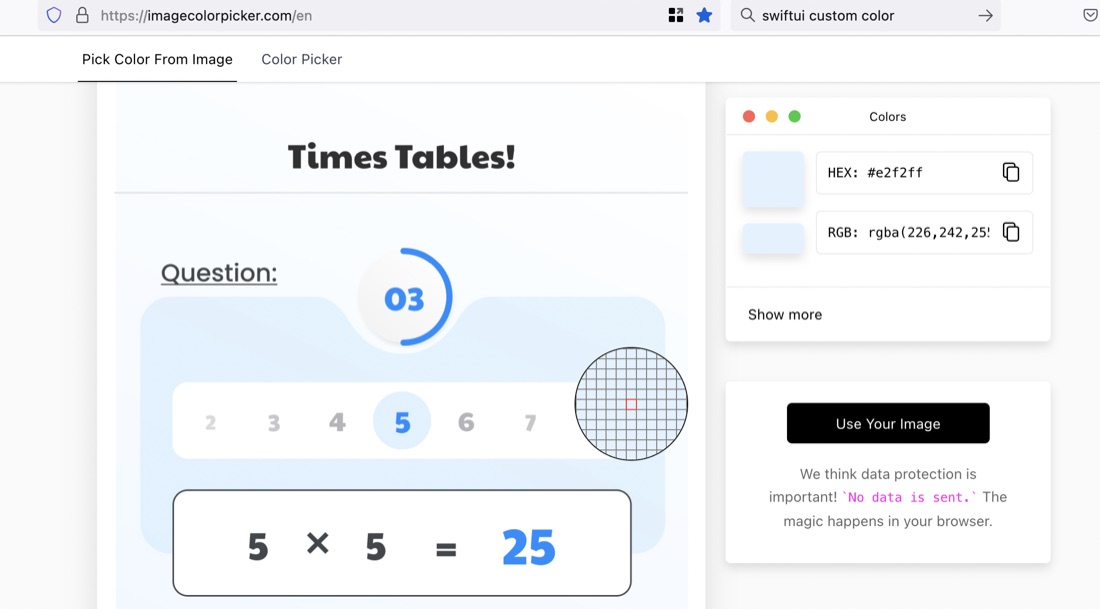
The site is ImageColorPicker. To use it, you “upload” your image (actually the image is not going anywhere - it’s all done in-browser). Then click on any area you want to identify the colour of.
Oct. 3, 2022
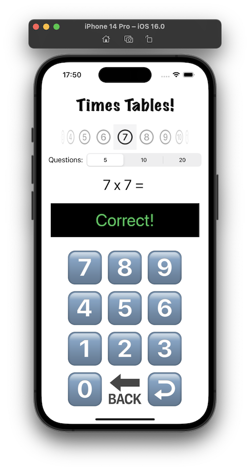
I think I mentioned when I’d completed the TimesTable app , that I was not happy with the design. It’s ugly, I don’t like the way the feedback about a wrong answer is shown at the same time as the next question, the number of questions setting would be rarely changed and looks uncomfortable where it is, I’m not sure the purpose of the picker for which times table would be clear, and it’s not appealing to children.
Sep. 29, 2022
The app I’m working on currently (for multiplication tables practice) has a number type keypad and display a bit like a calculator - but for entering the answers. It’s been quite fun to think through all the little problems to make it work how you’d expect, so I was quite interested to watch an iOS Academy video where Afraz Siddiqui builds a partially finished SwiftUI version of the iOS Calculator app.
Jul. 5, 2022
Here’s a rough plan for a “hello world” that’s simple enough to be achieved in the short term, but hopefully not too trivial to be accepted into the app store.
This is sketched out on GoodNotes 5. I started with the Apple Notes app, but was frustrated by not being able to mix text and drawing. Noteabilty looked great, but the once off purchase for GoodNotes was easier to swallow.